Perception and Reality: Statistics as Antidote to Illusions

Reflections on how hypothesis testing can dispel mistaken impressions using an example real-life survey

Nassim Abed

11/29/202516 min read

Share this article on your LinkedInShare this article on your LinkedIn

Try this: Ask a random colleague or business associate the following question: In your opinion, what percentage of business professionals use spreadsheets in their work? The answer will invariably be one of three types: Either a qualitative one (e.g. “a lot” or “everyone I know does” or a variation thereof) or a quantitative one, venturing a number or a range (e.g. “I think at least 90%”) – that may be a guess rooted in unsubstantiated confidence or a well-informed referenceable figure – or, if your colleague is indifferent or enjoys scientific humility and has no particular reference in mind, you may get the “I don’t know” answer.
Here's the thing: What kind of answer – you the reader – thought of when you read the question? And did you notice; the percentage is out there in the real world and should not be a matter of anyone’s opinion? After all, the actual use of software by others is not consequent to your preference.

Now consider the following questions, and imagine them in the context of a meeting or a panel discussion:

  • Do younger professionals prefer Google Sheets and are abandoning Microsoft Excel?

  • Are Mac users less likely to use Microsoft Excel compared to those on Windows?

Give these questions a thought. Throw them around colleagues over a coffee break and get a conversation going. Take note of how people engage in conversation, particularly the kind of affirmative sentences they may speak. You may hear things like “Excel is dying”, “the young generation prefers web-based applications”, or even “Mac users don’t use spreadsheets”. Reading those examples, you may be mentally nodding in agreement or eager to comment in disagreement.

Granted, these topics are not popular in 2025 when most talks and discussions around technical issues in business have been focused on the novelty of AI away from the entry-level mundane tools that spreadsheets are. Nonetheless, these tools – operating systems and spreadsheets – were selected for a quick survey specifically because they are ubiquitous, well established, and have been in continual use for decades since the early days of personal computers.

As you probably guessed by now, this article is not about operating systems and spreadsheet software. The survey thereon is a tool to demonstrate how reality may differ from perceptions like those statements in quotation marks above. Let’s take them and get skeptical: Is Excel a dominant spreadsheet software? Are younger people less likely to prefer it over Google Sheets? Do MacOS users work on Excel? Are they less likely to use Excel?
I ask you to notice how your brain is already working out the answers to these questions. If you ask them to someone else and they answer with anything other than “I don’t know”, challenge them: Ask them “how can you tell?” and see if they justify with confidence. So far, it’s about thoughts in brains. Opinions and/or memory and/or seemingly logical thinking that borrows from the baggage of perceptions about generations and their preferences and so on. But is that the same as reality out there? What do we see when we ask a hundred different people? And what can we learn about our own thinking process from this exercise?

That’s what this survey and article try to shed light on. Three simple questions in an anonymous Google Form disseminated over social media (LinkedIn and Facebook) and messaging groups (WhatsApp, Signal, Line) across several countries including but not limited to Thailand, UAE, Australia, Egypt, India, Canada, and Switzerland and across a diverse range of professionals and students as young as 15 and as old as 74 (based on the youngest and oldest who shared completing it, not withstanding anyone else who has not shared and might be older or younger).

The survey asked three questions with pre-defined options to choose from:

1. What year were you born?

2. Which operating system runs the device you consider as the main device for your work or study?

3. Which spreadsheet software do you prefer to use? (pick the one you prefer even if different from the one you may be required to use)

The survey was terminated few days after collecting 104 responses.

How many answered “I don’t use spreadsheets at all” in response to third question? Are you tempted to imagine these must all be either very old or very young? Well, only three (2.9%) did. They were one Baby Boomer (born 1946-1964), one Gen-X (1965-1980), and one millennial (1981-1996). The Baby Boomer was on Windows and the other two on MacOS. Could you conclude anything about age and use of spreadsheets? Of course not. Are you tempted to conclude anyway? Of course, yes. At least I was before seeing the tiny count of just three.

For what it’s worth, I asked Google “What percentage of business professionals use spreadsheets in their work?” on the afternoon of November 25th, 2025: The AI Overview kicked in and said approximately 80% of businesses rely on spreadsheets. Specifically, Google’s AI said 80% of businesses rely on Microsoft Excel. Keep that in mind. Also note this is Google that offers an alternative to Excel, Google Sheets. Now, did you notice that I asked about business professionals and the AI answered in terms of businesses and not in terms of people? I asked the exact same question to another AI, Claude (Sonnet 4.5): It said “around 54% of businesses globally use Excel specifically” – again answering not on people but on businesses but also more interestingly giving the impression Excel is way less popular (54%) than what Google’s AI said (80%). In our primary market research here, over 97% of the 104 respondents use spreadsheets – Excel or otherwise.

Now let’s get to the meat of this matter: Let’s dive into the 101 who do use spreadsheets and, now that we had AI singing the glory of Microsoft Excel, let’s see if our small sample is closer to Google’s opinion (80%) or Claude’s opinion (54%). The attribution of the term “opinion” to AI is deliberate here on grounds of lacking clarity exactly how AI works among the public and the intent to caution against taking whatever AI says as truth. Remember the days in the late 1990s when we had to be reminded not to believe anything the internet says?

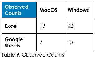
To the question “Which spreadsheet software do you prefer to use?”, 75% preferred Excel, 24% preferred Google Sheets, and one single respondent – Gen-X on MacOS – indicated they prefer LibreOffice Calc (no that’s not me; I’m a GenX on Linux and Windows using both Microsoft Excel on Windows and LibreOffice Calc on Linux, the former being my preferred spreadsheet software although the latter is a very close and perfectly free and open source contender)

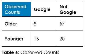
Now, might we imagine that being on Windows and using Excel go hand in hand and that we are more likely to find Google Sheets users sporting MacBooks? Could we get curious or have a hunch that older folks are probably entrenched in Excel whereas the younger generations are more likely Google Sheets users? Opinions and guesswork… What does the data tell us?

Before properly listening to our 101 respondents to find the answers, remember this is just an example: You could replace “Excel” and “Google Sheets” with the product you are selling and its competitors. You could replace “Windows” and “MacOS” with the service you are advertising. In your business you make decisions about where to advertise, what marketing channel to use, and what kind of clients to aim for. Decisions that require budgets and put a dent on your profitability and/or take up your time. Are your decisions based on hunches? Based on the experience of the marketing agency that is billing you? Or are you confident with a high degree of probability that your decisions are correct? Face it: Who are you listening to? Is it your pride posing as experience and hiding behind confidence following a good dose of positivity from your inspirational guru and lecturing you about gut feeling and courage? Is it the claim from your marketing agency? Or is it the voice of your customers and the data from your business?

Here is how to listen to the voice of your customers, using this simple survey and its possible interpretations as example.

There are three variables in the survey: Age group, operating system, and spreadsheet software or lack thereof. Moving forward the three who do not use spreadsheets at all are removed (in statistical jargon we say “brushed”) and the rest of the analysis focuses on the 101 who use spreadsheets.

The age groups could have been one of six based on options given to respondents, but none were born before 1946 or after 2012, so the dataset has four age groups: Baby Boomers (7% of respondents), Generation X (57%), Millennials (17%), and Gen-Z (19%). For the sake of simplicity, the older two and the younger two are grouped, so anyone born before 1981 is labelled “older” (64%) and the rest labelled “younger” (36%).

The operating systems could be Windows (74% of respondents), MacOS (21%), Linux (3%), or “Something else” (2%) – left general to accommodate for users of tablets and smartphones (yes, there are people who don’t use laptops or desktops. They roam among us). For the sake of simplicity and given the small numbers outside Windows and MacOS, these are grouped in two dichotomous groups: Windows (74%) versus Non-Windows (26%) and MacOS (21%) versus Non-MacOS (79%). As noted above, spreadsheet software could be Microsoft Excel (75%), Google Sheets (24%), or LibreOffice Calc (1%). A caveat here is that Microsoft Excel cannot be installed on Linux whereas Google Sheets and LibreOffice Calc can be used on any operating system.

So, what can the dataset tell us about the associations or lack thereof among any two of these three variables? Let’s interrogate the data using statistical hypothesis testing. In simple terms, statistics is this branch of mathematics that can calculate the odds of matters being totally random using calculations we call “hypothesis tests”. Keep in mind it’s about probabilities not about certainties. The term “confidence” is aptly borrowed by the statistical jargon to carry this crucial nuance. This implies when you look at what statistics say, you will invariably need to decide based on odds, knowing your decision could be an error but taking the chance as you see the odds numerically calculated and you are willing to judge them as low enough. Keep in mind this difference between statistics and the determinism you see in the formulae of classical physics describing natural laws like the gravity of Earth or atmospheric pressure and so on.

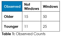
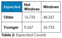
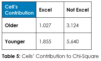
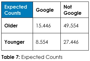
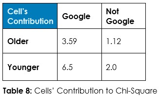
Interrogation Question 1: Data, tell us if the use of Windows versus other operating systems is associated with being older or younger, and tell us if it’s reasonable to believe older people are more likely to be on Windows.

Answer 1: Tabulate the observed counts in Table 1 and run Chi-Square statistical test to calculate expected counts if randomness dominates (Table 2) and calculate the odds of randomness instead of an association so we can decide about this hypothesized association – if we should admit random chance or if we should decide an association exists.

As with the previous question, take a good look at these two tables and try to figure out if the expected counts are close enough to the observed counts to say there is no association between age and preferring Excel. Our intuition may feel confident and sure, we may believe in a voice and what our gut is telling us. But we can’t, on our own, but guess. Statistics can calculate the odds of randomness. In this example, SigmaXL® tells us the p-value is 0.0006. That’s a low number we should interpret as too low odds that these observed counts are due to random chance. We are thus well advised to reject this idea of randomness here and conclude there is a significant association between age category and preference for Excel. But is it the younger, born after 1981, or the older who prefer Excel? For that, statistics can help: We look at another statistical calculation, the Chi-Square value in this kind of test, which comes to 11.646 and see how this number is distributed on the four categories, and which contributes more to that total (Table 5):

We see the Younger / Not Excel category has the largest number. Along with the low p-value, we can now say being younger (born after 1981) is significantly associated with using spreadsheet software other than Excel. An important point here is to remember this is probabilistic. This is not a set rule that younger folks don’t use Excel – it not a law of nature or anything of the sort. In fact, we observed twenty younger folks saying they prefer Excel versus only sixteen who said they prefer something else. In fact, if we guess by comparing these two observed counts, we may mislead by the counts, overlook how they fare compared to the counts among older people, and neglect the expected counts calculated based on assuming randomness.

Also note, this doesn’t tell the preferred alternative among the young. You may remember the counts on preference for Google Sheets and LibreOffice Calc from earlier. A dataset may have counts that are hard to guess. So let’s run another hypothesis test, looking for older versus younger by Google Sheets versus not Google Sheets (Tables 6, 7, and 8):

The p-value on this test is 0.0003. Looking at this low p-value and at the largest contribution to the Chi-Square statistic, you can conclude that there is a statistically significant association between being younger and preferring Google Sheets over other spreadsheet software.

Imagine if you are into spreadsheets as your business. Now imagine if you were surrounded by offices full of older people or younger people. These statistics can give you confidence in your business decisions: What to focus on, what skills to hire for, and what to spend promotional budgets on. Statistics can help you save costs and improve revenue. Do not make the mistake of assuming it’s purely academic.

Another point here is to investigate further and see if this association is also significant between millennials and the younger Gen-Z. Let’s run the statistical test for these sub-groups. It so happens that in the surveyed samples, all millennials and all Gen-Z prefer either Microsoft Excel or Google Sheets, with no third alternative. Because it is a sub-group, the counts are now smaller: 11 millennials said they prefer Excel and 6 went for Google sheets, 9 Gen-Z said they preferred Excel versus 10 for Google Sheets. The Chi-Square test gives a p-value of 0.2960, too high to comfortably speak of any association. Note that as the counts of subgroups go small, particularly below 5, a better statistical calculation would be the Fisher’s Exact test that is like the Chi-Square test – in this case it gives a slightly different p-value, 0.3351 resulting in the same conclusion. The lesson here is that for each data set there is appropriate hypothesis testing that may not be applicable to another data set even if it seems similar. In other words, like how you better consult your doctor before taking any pills, you better know your statistics before running them, let alone making decisions based on gut and guesswork alone.

One last hypothetical association to check for is between the operating system used and the preferred spreadsheet software. For the sake of simplifying and since Microsoft Excel cannot be directly installed on Linux and since only one user prefers LibreOffice Calc, let’s brush these and look at the dataset limited to either Windows or MacOS and to either Excel or Google Sheets, with summarized counts in Table 9:

The temptation here is to hypothesize that since Excel is a Microsoft product Windows users will be more likely to use Excel instead of any alternative and that since MacOS users who have other alternatives such as the spreadsheet software Numbers from Apple, may be less likely to use Excel. You may be surprised to know that when Microsoft released the very first version of Excel back in September 1985, it was for the Apple Macintosh and not for the MS-DOS, Microsoft’s operating system at the time. That’s right: It was not until November 1985, four whole decades at the time of writing this, that Microsoft released Windows 1.0. So yes, Excel is older than Windows and was first for the Mac. This lesser-known history may play into the imagined hypothesizing in our heads: The Chi-Square statistical test on this survey data set tells is the p-value here is 0.0851.

Now this is interesting because one may see this as a low p-value and decide the association is significant. And when you look at Table 10 here, it suggests the association would be between using MacOS and preferring Google Sheets. That would probably be confusing given the history noted above. You may also remember that there was no significant association between age categories and operating systems. So, what’s the correct conclusion here, is there association between operating system and spreadsheet preference? Narratives can be confusing. Methodical consistency using statistics is not. A commonly used threshold for deeming p-values too high or too low is 0.05. If we apply that religiously, we should not speak of a significant association here. We may be tempted to say 90% is good enough and 0.085 is below 0.1 so let’s call that significant. But what if it were 0.24 or 0.31 instead? Do you enjoy coin tossing? If we declare significance on a higher p-value, we are effectively accepting a higher risk of our decision being wrong. Statisticians like to speak of Type 1 Error (false positive) and Type 2 Error (false negative). There is a simpler way of looking at it, mathematics aside: Is it a risk you can afford? Are you betting on the farm here or are you betting on the truck? Will losing break the bank? Such qualitative way of looking at it may come in handy, particularly if you must decide without any data whatsoever – if collecting requisite data takes too long or is too expensive and jumping into a mistake is less of a problem anyway.

In conclusion, I hope reading this left you aware why statistical hypothesis testing is relevant in decision-making and exactly what proper statistical analysis can do: Statistics can help us tell if what we think is water at a distance is mirage or not. More accurately, the likelihood of picking a choice as being the right choice and not being wrong.

This is one silly survey with three silly questions. A far cry from the complexities of your business and probably orders of magnitude simpler than, say, the data from your CRM or your warehouse management system or your e-commerce analytics. But are you applying odds calculations statistically on those? Learning how to do that is neither daunting nor expensive. Sure you could outsource it or hire someone to do it but you can also learn it and get the proper software so you can evolve beyond the simplistic charts and uniform-ish dashboards that leave your questions unanswered. I am here to help you.

Note here that the observed counts, coming from asking 101 people, are not easy to look at and answer the question without calculations. I could stare and reflect at Table 1 and a team of managers can sit around a meeting room table and debate it over as many cups of coffee as they please, it’s not going to be easy to decide and likely be correct just by looking at these tabulated numbers. All the pie charts and colorful graphs in the world wouldn’t help except perhaps create one illusion or another that can get mixed in a cocktail of egos and office politics. Good luck to the truth.

The expected counts in Table 2 are calculated by the software that can run these statistics – in this case SigmaXL® was used – which explains how come the numbers are not whole. Interpreting those numbers by shear eyeballing is not any easier. The software runs further statistical calculations and outputs a P-Value, a single number between 0 and 1, that helps us to decide how we should interpret all this. In this example, the p-value was 0.4103. Short of diving into deeper mathematics, let’s think of the p-value as the probability of total randomness. If it’s low, closer to 0, then chances are something is not random, and we should probably conclude there is indeed an association between age category – born before 1981 or afterwards in this case – and using Windows or something else. Here the p-value is almost in the middle between 0 and 1. In statistics, a rule of thumb is using 0.05 as a threshold below which we can say this is not random and the association is “significant”. This is a matter of convention.

In this case, the conclusion is no, we cannot say older people prefer Windows over other operating systems, because the p-value was 0.4103, way too high for comfort. That is what this test says.

Now imagine if you had to decide on a budgetary direction based on this question. Would you be comfortable going by gut and what seems to make sense? Your own opinion or even the opinion of all your colleagues or the opinion of some expert? Surely if we stock this product in this store near a university campus then all the students will love it. Surely, since my three good friends told me my fusion cooking is delicious that if I open a restaurant, it will be profitable. This is not a story on the psychology of confidence here. This is not about introspection and meditation and not about motivating others and the wonderful world of leadership skills. This is about looking at reality in the face and trying to see it for what it is. How you feel about it is a different story and remains a factor in the full complexity of your human experience but here it’s about one simple question at a time. No magic, just math.

For what it’s worth and since the dataset is at hand and since SigmaXL® helps running statistics fast and easy, there was no significant association between age category and using MacOS or something other than MacOS. If I were trying to sell computers, I would probably not spend any budget on targeting younger customers with advertisements for Apple computers. Statistics help with smarter budgeting, it seems.

Interrogation Question 2: Data, tell us if the age category makes it more likely to prefer Google Sheets over Microsoft Excel. Is it really that Google Sheets is more popular among younger people?

Answer 2: Tabulate the observed counts in Table 3 and run Chi-Square statistical test to calculate expected counts if randomness dominates (Table 4) and calculate the odds of randomness instead of an association so we can decide about this hypothesized association – if we should admit random chance or if we should decide an association exist